Converting data into visually appealing graphs is a powerful way to communicate insights and trends. Google Sheets offers a user-friendly platform to create a variety of charts and graphs without the need for complex software. In this step-by-step guide, we'll walk you through the process of transforming your Google Sheets data into professional-looking graphs that effectively showcase your information.
When it comes to visualizing data in Google Sheets, selecting the appropriate chart type is crucial for effectively communicating your message. Different graph types serve distinct purposes, so understanding which one best suits your data is key. Here are some common chart types and their ideal use cases:
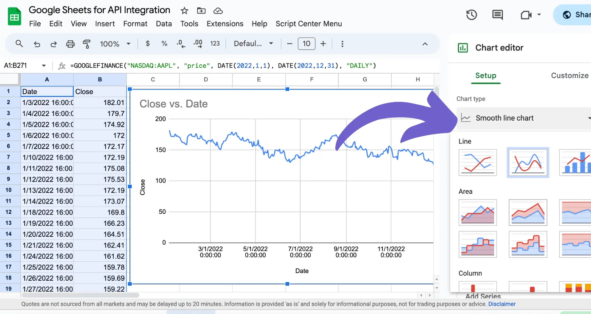
Google Sheets offers a wide variety of chart types, each designed to showcase your data in a specific way. By carefully considering the nature of your data and the insights you want to convey, you can choose the most effective graph type to make your data shine. For further assistance, check out GPT for Google Sheets to streamline your data visualization process.
Before creating a chart in Google Sheets, it's essential to ensure your data is organized and structured correctly. This step is crucial because the way you arrange your data directly impacts the accuracy and effectiveness of your visualizations. Here are some tips for preparing your data:
To further refine and organize your data, you can use built-in Google Sheets functions. For example:
By taking the time to properly structure and clean your data, you'll be able to create accurate, visually appealing charts that effectively communicate your insights. Consider using tools to enrich your data for even better results.
Bardeen helps you automate tasks in Google Sheets, saving time and improving accuracy. Learn how to connect Google Sheets and streamline your workflow.

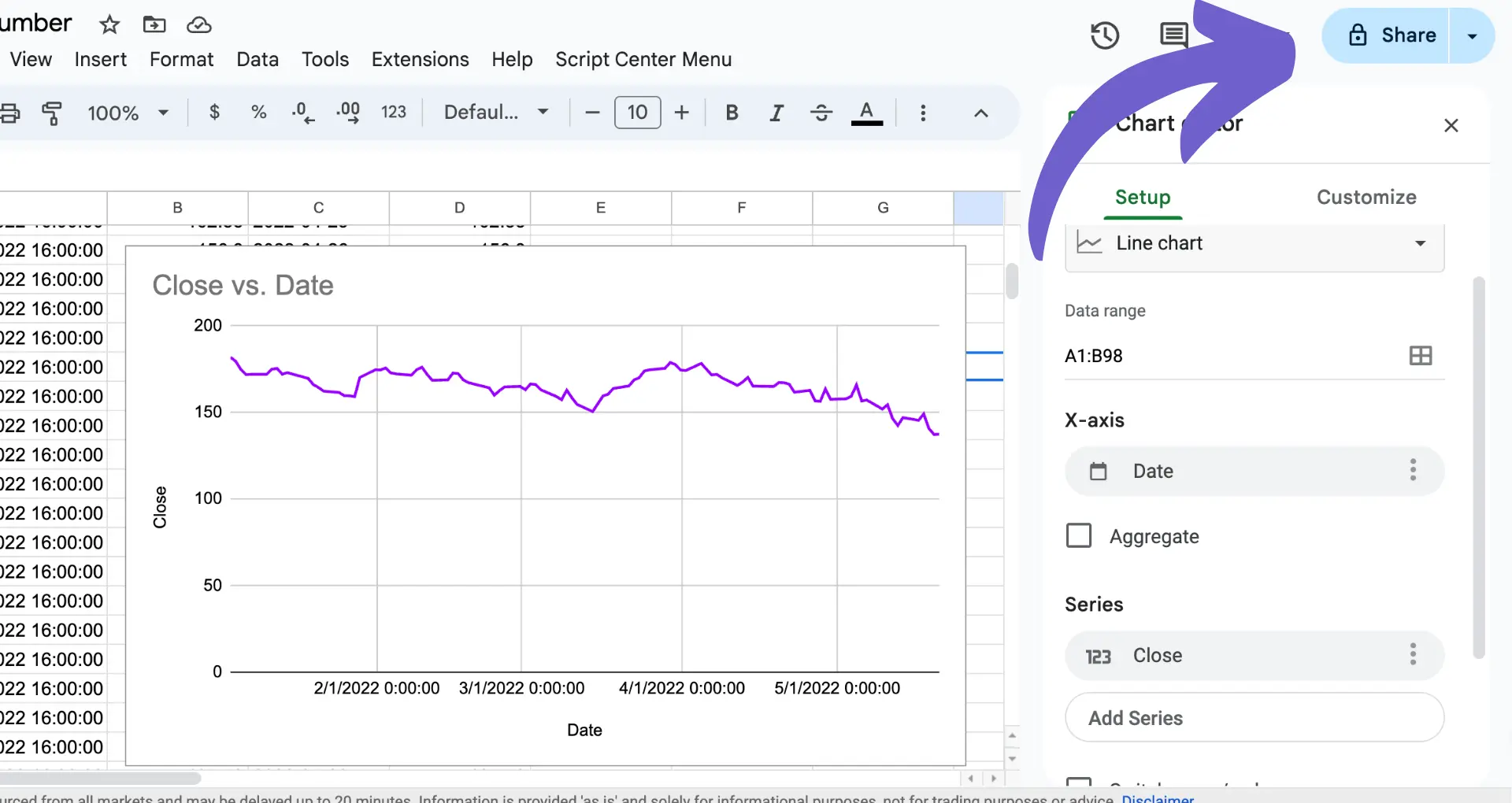
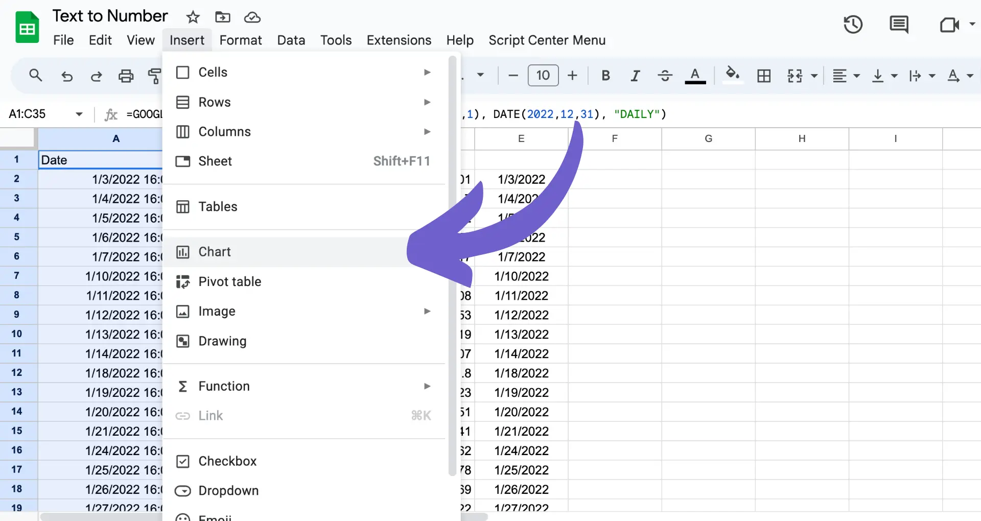
Creating a chart in Google Sheets is a straightforward process. Follow these steps to insert a chart:
Once you have inserted a chart, you can customize it to better suit your needs:
To further enhance your chart's readability and aesthetics, consider the following tips:
By taking advantage of Google Sheets' built-in customization options, you can create professional-looking charts that effectively communicate your data insights. For more advanced features, check out how to connect Google Docs and other tools with Google Sheets.
Google Sheets offers several advanced features that allow you to create more complex and insightful charts. One such feature is the ability to add trendlines to scatter plots, which can help you identify patterns and relationships between variables. To add a trendline, select your scatter plot and navigate to the "Customize" tab in the chart editor sidebar. Under the "Series" section, click on "Trendline" and choose the type of trendline you want to add, such as linear, exponential, or polynomial.
Another advanced feature is the use of secondary axes in combo charts. This allows you to plot data series with different scales on the same chart, making it easier to compare and analyze the relationships between them. To add a secondary axis, create a combo chart and select the data series you want to assign to the secondary axis. Then, in the chart editor sidebar, click on the dropdown menu next to the data series and choose "Secondary axis."
To create responsive charts that automatically update as your data changes, you can use dynamic ranges and named ranges. Dynamic ranges use functions like OFFSET() and COUNTA() to automatically adjust the range of cells included in your chart as new data is added or removed. Named ranges allow you to assign a name to a specific range of cells, making it easier to reference them in your chart's data range.
If you work with LinkedIn data, you can enrich LinkedIn profiles in your Google Sheets to enhance your charts and analyses.
Save time by using Bardeen's LinkedIn data scraping tools. Automate data updates and keep your charts relevant and current.
Here's how to create a dynamic range for your chart:
Now, whenever you add or remove data from the named range, your chart will automatically update to reflect the changes. By leveraging these advanced features and techniques, you can create more powerful and dynamic charts in Google Sheets that provide deeper insights into your data.
Once you've created a chart in Google Sheets, you may want to share it with others or publish it on a website. Google Sheets provides several options for sharing and publishing your charts.
To share a chart within Google Sheets:
If you want to publish your chart on a website or blog, follow these steps:
When you publish a chart, it becomes accessible to anyone with the link or anyone who visits the website where it's embedded. Keep this in mind if your chart contains sensitive or confidential data.
You can also download your chart as an image file (PNG or SVG) or a PDF document. To do this, click on the three-dot menu icon in the top right corner of the chart and select "Download as." Choose your desired file format and click "Download."
By sharing and publishing your charts, you can collaborate with others and showcase your data visualizations to a wider audience. Just remember to set appropriate permissions and consider the sensitivity of your data before sharing or publishing. If you need more advanced features, you can connect Excel for better integration.


SOC 2 Type II, GDPR and CASA Tier 2 and 3 certified — so you can automate with confidence at any scale.