how to convert pivot table to chart in google sheets
Automation Tips
Google Sheets
Published on
March 18, 2024
Pivot tables in Google Sheets are powerful tools for organizing and analyzing data, but sometimes a visual representation can make your insights even clearer. In this step-by-step guide, we'll walk you through the process of converting a pivot table to a chart in Google Sheets. By following these simple steps, you'll be able to create compelling visualizations that effectively communicate your data's story.
Understanding Pivot Tables in Google Sheets
A pivot table is a powerful tool in Google Sheets that allows you to summarize and analyze large sets of data. It helps you quickly identify patterns, trends, and relationships within your data by dynamically rearranging and aggregating information based on specified criteria. Creating a pivot table in Google Sheets is a straightforward process:
Select the data range you want to analyze, ensuring that each column has a header.
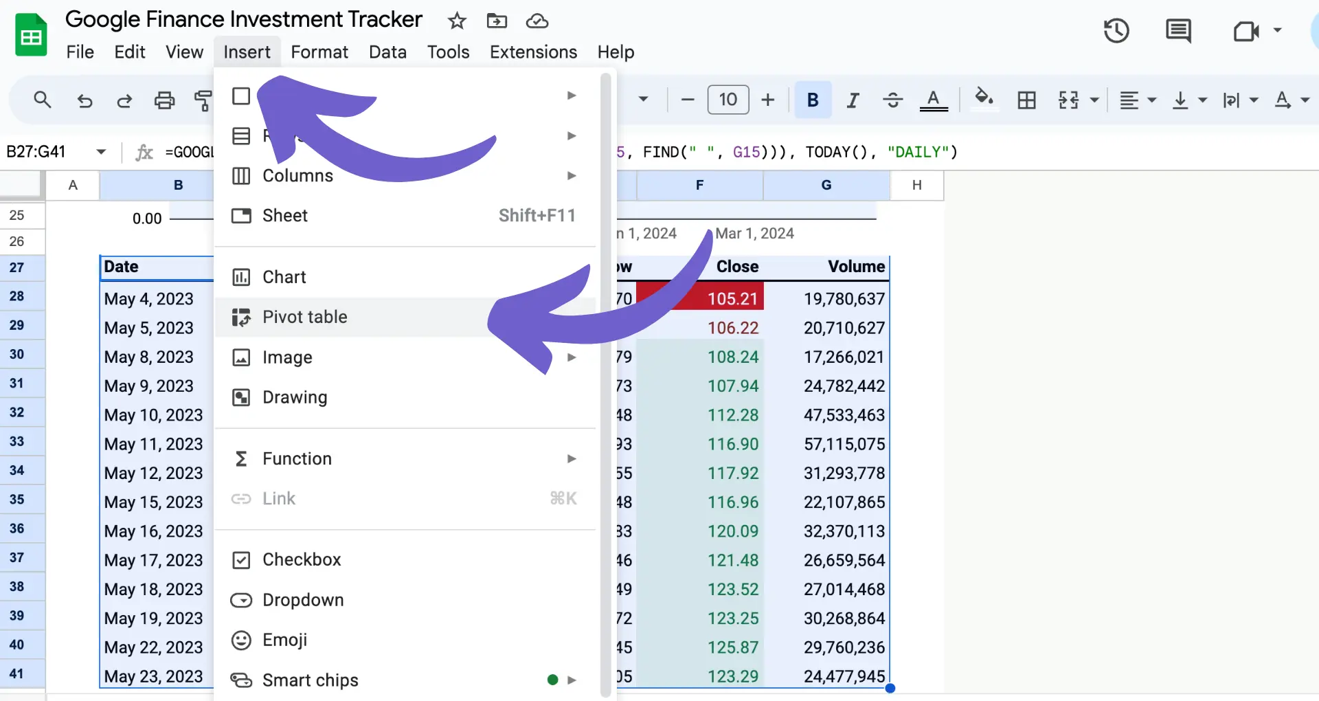
Click on the "Insert" menu and select "Pivot table."
Choose the destination for your pivot table, either a new sheet or an existing one.
When setting up your pivot table, it's crucial to select the appropriate data columns for rows, columns, and values. Rows and columns define how your data will be grouped and organized, while values determine the aggregated metrics you want to analyze, such as sums, averages, or counts. By carefully selecting these elements, you can create a pivot table that effectively summarizes your data and provides valuable insights. For more advanced features, consider using GPT in Google Sheets to streamline your workflows.
Preparing Data for Conversion to Chart
Before converting your pivot table to a chart, it's essential to clean and organize the data for optimal visualization. Here are some steps to prepare your pivot table data:
Ensure your data is accurate and complete. Remove any duplicates, errors, or inconsistencies that may skew your chart.
Sort your data based on a relevant metric, such as date, category, or value, to make trends and patterns more apparent in the chart.
Filter out any unnecessary data points that don't contribute to the overall story you want to tell with your chart.
Consider adding calculated fields to your pivot table to derive additional insights, such as percentages, variances, or running totals. This can include lead enrichment data for more in-depth analysis.
By taking the time to format your pivot table data properly, you'll create a solid foundation for a clear and effective chart that communicates your key findings at a glance. For more advanced features, consider integrating Google Sheets to enhance your workflow.
Save time and improve accuracy by using Bardeen for no-code web scraping. Automate data extraction and focus on analyzing results instead.
Choosing the Right Chart Type for Your Data
Google Sheets offers a variety of chart types to visualize your pivot table data effectively. Here are some common chart types and their best use cases:
Bar charts: Best for comparing values across categories or showing the relationship between parts of a whole.
Column charts: Ideal for comparing data points or values over time or displaying variations in data for different categories.
Line charts: Perfect for visualizing trends, patterns, or changes in data over a continuous time period.
Pie charts: Great for showing the proportions or percentages of a whole, especially when you have a small number of categories.
Scatter charts: Useful for displaying the relationship between two variables or identifying outliers and clusters in your data.
When selecting a chart type for your pivot table data, consider the following factors:
The type of data you have (e.g., numerical, categorical, time-based).
The story you want to tell with your data (e.g., comparisons, trends, proportions).
The level of detail required to convey your message effectively.
By aligning your chart type with the nature of your data and the insights you want to highlight, you'll create a compelling visual that enhances your data story.
Converting Pivot Table to Chart in Google Sheets
To convert your pivot table into a chart, follow these step-by-step instructions:
Click on any cell within your pivot table to select it.
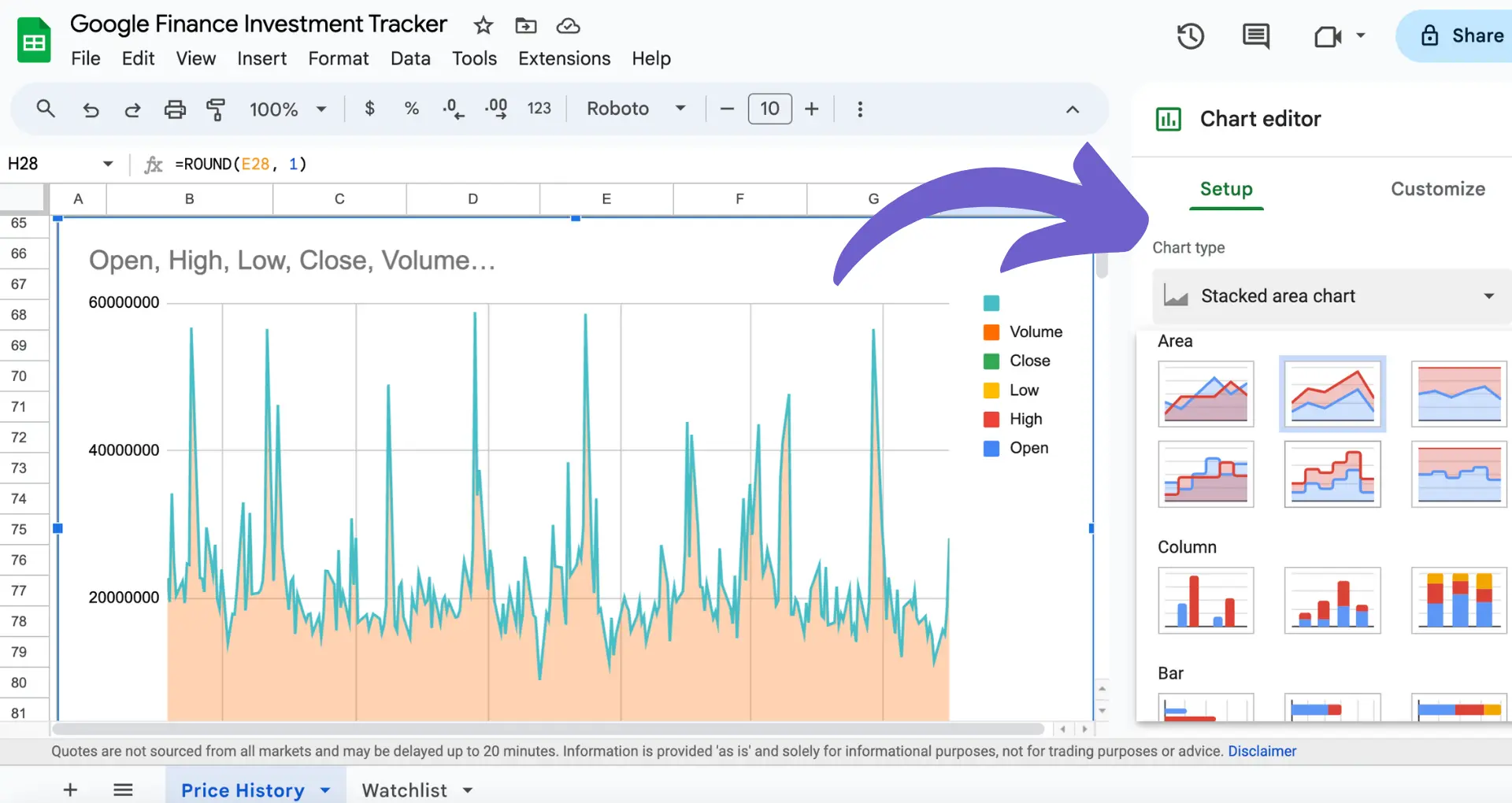
Go to the Insert menu and select Chart. Google Sheets will automatically generate a chart based on your pivot table data.
Alternatively, use the Explore feature located at the bottom right of the Google Sheets interface. Click on Explore, and it will suggest various charts based on your pivot table data. Choose the most suitable chart to insert into your sheet.
After creating the chart, you can customize it further using the Chart editor pane:
Click on the chart to bring up the Chart editor on the right side of the screen.
Change the chart type, customize its appearance, and adjust various settings to better represent your data.
Google Sheets provides a range of options, including column, bar, line, and pie charts, to suit your data visualization needs.
Keep in mind that the chart you create is dynamically linked to the pivot table data. Any changes made to the pivot table, such as filtering or updating the data, will automatically reflect in the chart, ensuring a real-time visual representation of your data analysis.
Connect Google Sheets to other apps, like Microsoft Excel, with Bardeen's integration to save time and automate your tasks.
Enhancing and Customizing Your Chart
Google Sheets offers a wide range of customization options to enhance your chart's appearance and better represent your data. To access these options, double-click your chart to open the Chart editor pane on the right side of the screen.
Here are some key customization features:
Chart type: Change the chart type to better suit your data, such as switching from a column chart to a line chart or a pie chart.
Chart style: Modify the chart's background color, font, and other visual elements to match your presentation or report style.
Chart & axis titles: Add, edit, or remove chart and axis titles to provide clear labels for your data.
Series: Customize individual data series by changing colors, line thickness, or point symbols to highlight specific data points or trends.
Legend: Adjust the legend position, font, style, and color to improve readability and match your overall design.
Gridlines & ticks: Add or remove gridlines and ticks to enhance data readability and provide visual reference points.
When customizing your chart, consider the following tips:
Choose a chart type that effectively communicates your data insights, such as using a line chart for tracking trends over time or a bar chart for comparing categories.
Use colors and styles consistently throughout your presentation or report to maintain a professional and cohesive look.
Keep your chart simple and clutter-free by removing unnecessary elements or data points that don't contribute to your main message.
Ensure that your chart is easy to read by selecting appropriate font sizes, colors, and styles for titles, labels, and legends.
By leveraging these customization options, you can create visually appealing and informative charts that effectively communicate your pivot table insights to your audience.