Salesforce, a powerful Customer Relationship Management (CRM) tool, offers robust reporting capabilities that help businesses gain valuable insights from their data. One of the most effective ways to enhance Salesforce reports is by adding charts, which provide a visual representation of the data, making it easier to understand and analyze. In this step-by-step guide, we'll walk you through the process of adding a chart to your Salesforce report, helping you unlock the full potential of your data.
Salesforce
Introduction to Salesforce Reporting
Salesforce, as a leading Customer Relationship Management (CRM) tool, offers powerful reporting capabilities that enable businesses to gain valuable insights from their data. These insights help organizations make informed decisions, optimize their processes, and drive growth. Salesforce provides a wide range of report types, each designed to cater to specific business needs and requirements.
The different types of reports available in Salesforce include:
Tabular Reports: Present data in a simple, tabular format, making it easy to view and compare information.
Summary Reports: Aggregate data and provide a high-level overview of key metrics and performance indicators.
Matrix Reports: Allow users to group and summarize data by both rows and columns, enabling advanced data analysis.
Joined Reports: Combine data from multiple report types into a single report, providing a comprehensive view of related information.
Adding charts to Salesforce reports takes data visualization to the next level. Charts provide a visual representation of the data, making it easier for users to identify trends, patterns, and outliers. By incorporating charts into reports, businesses can:
Quickly grasp key insights and trends without diving deep into the raw data.
Communicate complex information in a more accessible and engaging manner.
Facilitate data-driven decision-making by highlighting critical metrics and performance indicators.
For more advanced techniques, consider exploring AI sales automation to enhance your Salesforce reporting experiences.
Creating a Basic Salesforce Report
Creating a new Salesforce report is a straightforward process that begins with selecting the appropriate report type and ends with adding the necessary data fields. Follow these steps to create a basic Salesforce report:
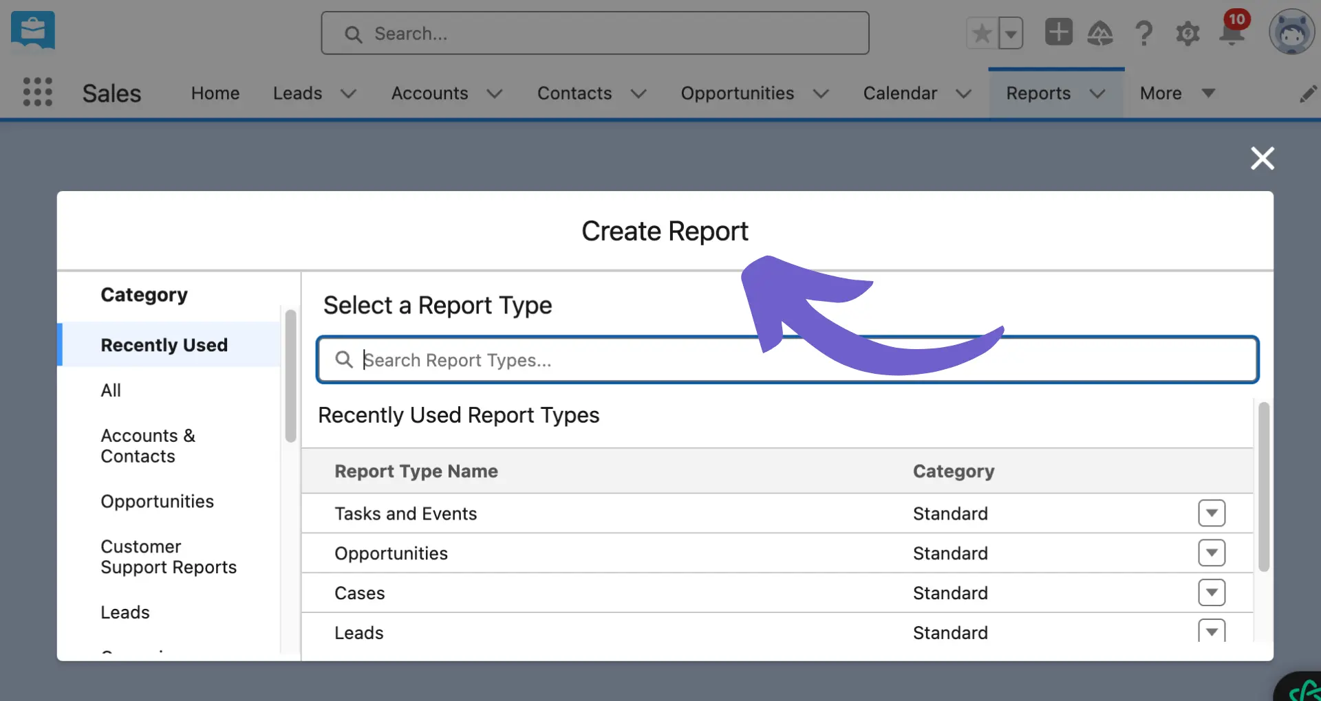
Navigate to the Reports tab in Salesforce. If you don't see the tab, click on the App Launcher (9 dots) to find it.
Click on the "New Report" button to start creating a new report.
Choose the report type that best fits your requirements. This could be a standard report type or a custom report type created by your organization.
Once you've selected the report type, click on the "Create" button to open the report builder.
In the report builder, you can define the report's filters, groupings, and fields to display.
To add filters, click on the "Filters" panel and select the desired criteria. You can use the standard filters or create custom ones based on your needs.
To select the fields to display in your report, navigate to the "Fields" panel and choose the relevant fields from the available options.
If you want to add groupings to your report, drag and drop the desired fields into the "Groupings" section. This is particularly useful for Summary and Matrix reports.
Once you've configured the report to your liking, click the "Save" button to save the report.
Provide a name for your report, select the appropriate report folder, and click "Save and Run" to view the generated report.
It's important to note that not all report types support the addition of charts. Summary and Matrix reports are the most common types that allow you to include charts for better data visualization. Tabular reports, on the other hand, are best suited for simple data listings and exports. For automating data collection and qualification tasks, consider using tools like Bardeen for building prospect lists.
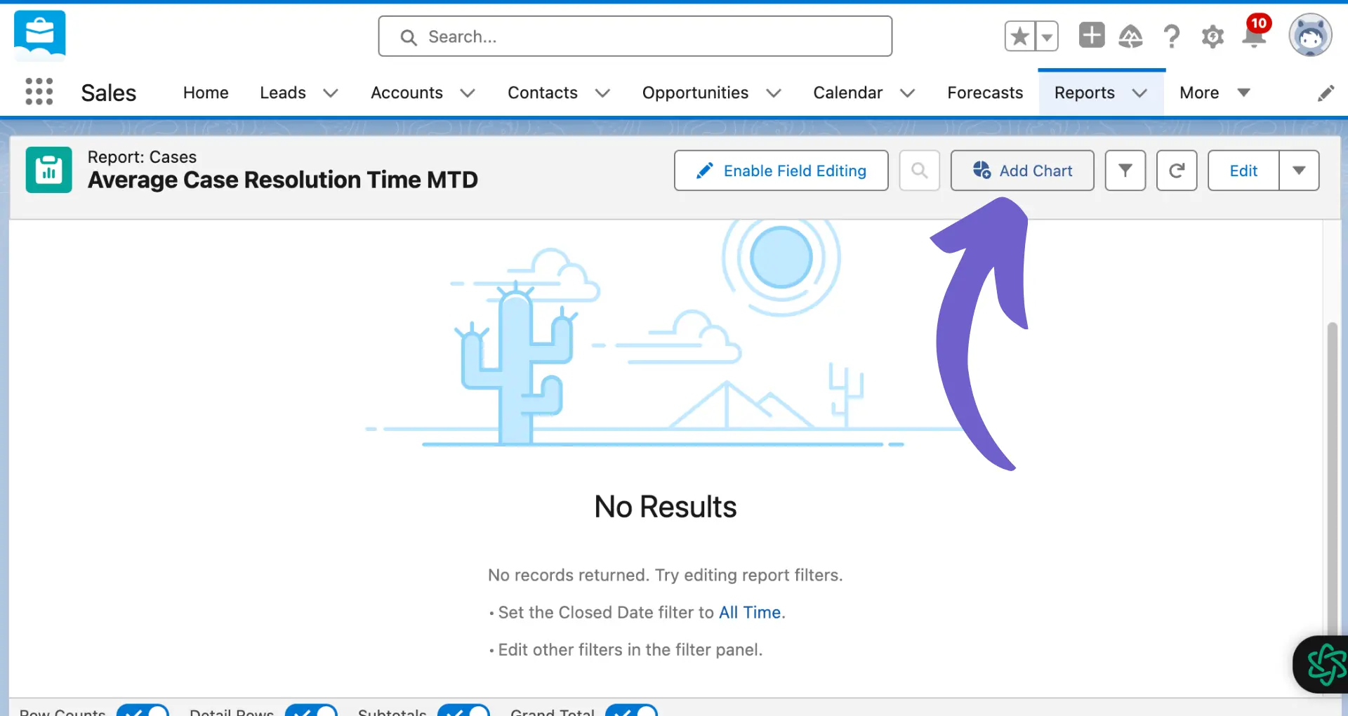
Once you have created a basic Salesforce report, you can enhance it by adding a chart to visually represent the data. To add a chart to your existing report, follow these steps:
Open the report you want to add a chart to in the report builder.
Click on the "Add Chart" button located in the report builder's toolbar.
Select the chart type that best suits your data and the insights you want to convey. Salesforce offers various chart types, including:
Bar charts: Ideal for comparing values across different categories or showing trends over time.
Pie charts: Best for displaying the composition or proportion of a whole.
Line charts: Perfect for visualizing trends or changes in data over a continuous period.
Funnel charts: Useful for representing stages in a sales process or any sequential process with varying completion rates.
When choosing a chart type, consider the nature of your data and the message you want to communicate. For example, if you want to show the relative contribution of each salesperson to the total sales, a pie chart would be a suitable choice.
After selecting the chart type, configure the chart's properties in the chart editor. This includes specifying the data source, defining the chart axes, and customizing the appearance of the chart.
Drag and drop the appropriate fields from the report into the chart editor to define the chart's data source. For example, you might drag the "Sum of Amount" field to the Y-axis and the "Stage" field to the X-axis for a bar chart showing the total sales amount by stage.
Customize the chart's appearance by adjusting the color scheme, adding data labels, and modifying the chart title and axis labels to ensure clarity and readability.
Once you have configured the chart to your liking, click "OK" to add the chart to your report.
Save the report to ensure that the newly added chart is preserved.
By adding a chart to your Salesforce report, you can provide a visual representation of your data, making it easier for your audience to grasp key insights and trends at a glance. Consider using sales intelligence tools to enhance your data analysis.
Customizing and Configuring Chart Settings
After adding a chart to your Salesforce report, you can customize its settings to ensure that it effectively communicates the insights you want to convey. To customize your chart, follow these steps:
Click on the chart in your report to open the chart editor.
In the chart editor, you can modify various aspects of your chart, such as:
Chart Type: If needed, you can change the chart type to better suit your data or the message you want to convey.
Axes: Define the values for the X and Y axes by dragging and dropping the appropriate fields from the report. You can also customize the axis labels and scales.
Color Scheme: Choose a color scheme that aligns with your brand or makes the chart visually appealing and easy to understand. You can select from predefined color palettes or create a custom one.
Data Labels: Add data labels to your chart to display the exact values for each data point. This can help your audience quickly grasp the information presented.
Legend: Customize the legend to clearly define the meaning of each color or pattern used in your chart.
To make your chart more interactive and insightful, consider using advanced features like:
Drill-Downs: Enable drill-downs to allow users to click on a specific data point and access more detailed information. This is particularly useful when presenting high-level data that requires further exploration.
Hover-Over Information: Configure hover-over text to display additional information when users mouse over a specific data point. This can provide context or details without cluttering the chart.
Once you have customized your chart settings, click "OK" to apply the changes and close the chart editor.
Save your report to ensure that the chart customizations are preserved.
By taking the time to customize and configure your chart settings, you can create visually appealing and informative charts that effectively communicate key insights to your audience. For more tips on how to prepare for sales presentations, explore our detailed guides.
Save time by automating your data integration tasks. Check out how you can integrate Excel with other tools, no code needed.
Troubleshooting Common Chart Issues in Salesforce Reports
While adding charts to Salesforce reports is generally a straightforward process, users may occasionally encounter issues. Here are some common problems and their solutions:
The 'Add Chart' option is greyed out:
Ensure that you are using a report type that supports charts, such as Summary or Matrix reports. Tabular reports do not support charts.
Check your user permissions to make sure you have the necessary access to create and edit reports and charts.
The chart is not displaying data:
Verify that the report has data and that the necessary fields are included in the report.
Check the chart settings to ensure that the correct fields are mapped to the X and Y axes.
Ensure that the report filters are not excluding relevant data.
Users are unable to view the chart:
Check the sharing settings for the report folder to ensure that users have the appropriate access level (e.g., Viewer, Editor, or Manager).
Verify that users have the necessary permissions to view reports and dashboards in their profiles or permission sets.
If the report is based on objects and records not available to certain license types (e.g., Chatter Plus licenses), those users may not be able to view the chart.
The chart is displaying an error message:
If the error message indicates a problem with a specific field or filter, try removing that field or filter from the report and chart settings.
If the issue persists, contact Salesforce Customer Support, providing as much information as possible, including the error code, to help them reproduce and resolve the problem.
By understanding these common issues and their solutions, you can quickly troubleshoot and resolve problems when adding charts to your Salesforce reports, ensuring that your data visualization efforts are effective and informative. For more tips on improving your reports, explore sales discovery questions.