Create Graphs in Google Sheets: A Step-by-Step Guide

LAST UPDATED
September 4, 2024
Jason Gong
apps
No items found.
TL;DR

Select data, click Insert, choose Chart, and customize.

By the way, we're Bardeen, we build a free AI Agent for doing repetitive tasks.

If you use Google Sheets, you might love Bardeen's GPT in Spreadsheets feature. It helps with summarizing, generating, formatting, and analyzing data. Save time and improve your workflow.

Google Sheets is a powerful tool for organizing and analyzing data, and one of its most valuable features is the ability to convert data into visually appealing graphs. Graphing in Google Sheets allows you to effectively communicate insights and trends hidden within your data, making it easier for others to understand and interpret. In this step-by-step guide, we'll walk you through the process of converting your data into a graph using Google Sheets, from selecting the right chart type to customizing your graph for maximum impact.

Introduction to Google Sheets Graphing

Data visualization is a crucial aspect of data analysis, and Google Sheets provides a user-friendly platform to create informative and visually appealing graphs. By converting your data into graphs, you can effectively communicate trends, patterns, and insights to your audience. Understanding key terminologies is essential for creating accurate and meaningful graphs:

  • Data range: The set of cells containing the data you want to visualize in your graph.
  • Chart type: The visual representation of your data, such as line, bar, or pie charts, each suited for different data types and purposes.
  • Axis: The horizontal (x-axis) and vertical (y-axis) lines that define the boundaries of your graph and provide a scale for your data.

Familiarizing yourself with these basic concepts will help you connect Google Sheets and navigate the process of creating graphs in Google Sheets with ease.

__wf_reserved_inherit

Selecting the Right Chart for Your Data

Google Sheets offers a variety of chart types to help you effectively visualize your data. Some of the most commonly used charts include:

  • Line charts: Ideal for displaying trends or data changes over time.
  • Bar charts: Perfect for comparing data across different categories or groups.
  • Pie charts: Best for showing proportions or percentages of a whole.
  • Scatter charts: Used to identify trends and patterns between two variables.
  • Area charts: Similar to line charts but with the area below the line filled in, making it easier to visualize volume.
__wf_reserved_inherit

When selecting the right chart for your data, consider the following factors:

  1. The type of data you have (numerical, categorical, or time-based).
  2. The relationship between your data points (comparison, distribution, or composition).
  3. The message you want to convey to your audience (trends, proportions, or correlations).

By aligning your chart type with your data and visualization goals, you can create meaningful and easily understandable graphs in Google Sheets. To save more time, learn how to bring AI into your spreadsheet for advanced data analysis.

Use Bardeen to add ChatGPT to Google Sheets and save time with data tasks.
__wf_reserved_inherit

Preparing Your Data for Graphing

Before creating a graph in Google Sheets, it's crucial to organize your data effectively. Well-structured data ensures that your graph accurately represents the information you want to convey. Here are some steps to prepare your data for graphing:

  1. Arrange your data in a logical format, typically with labels in the first row and corresponding values in the columns below.
  2. Ensure that your data is consistent and free from errors, such as missing values or incorrect data types.
  3. If necessary, clean your data by removing duplicates, fixing typos, and ensuring that all values are in the correct format (e.g., dates, currencies, or percentages).
  4. Consider creating separate columns for each variable or category you want to include in your graph. This will make it easier to select the appropriate data range when creating the chart.

By taking the time to organize and clean your data, you'll be able to create accurate and visually appealing graphs in Google Sheets. To further enhance your data analysis, explore integrating data scraping tools for additional insights.

Creating a Graph in Google Sheets

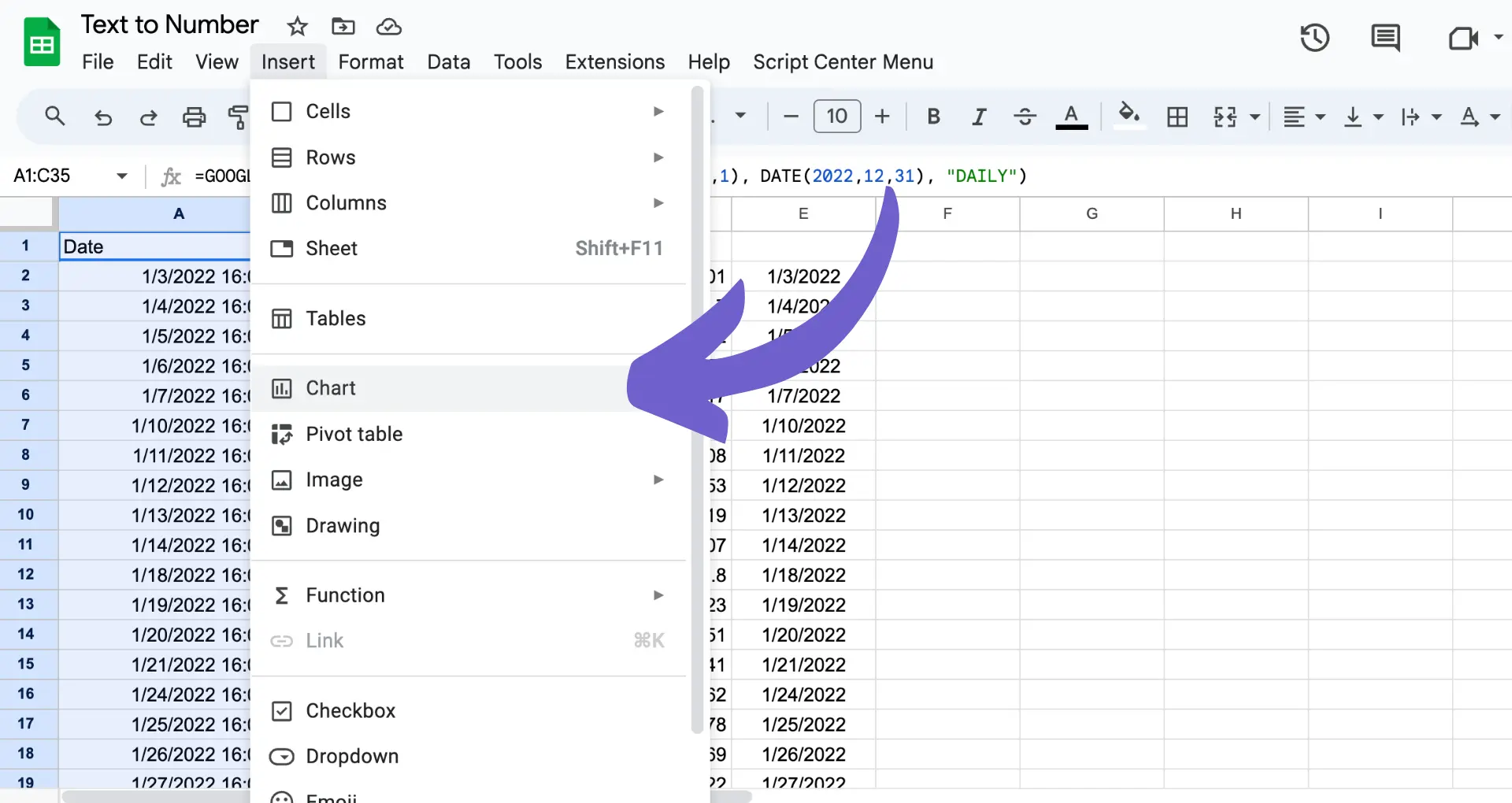
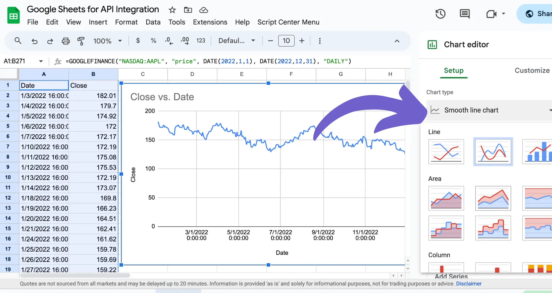
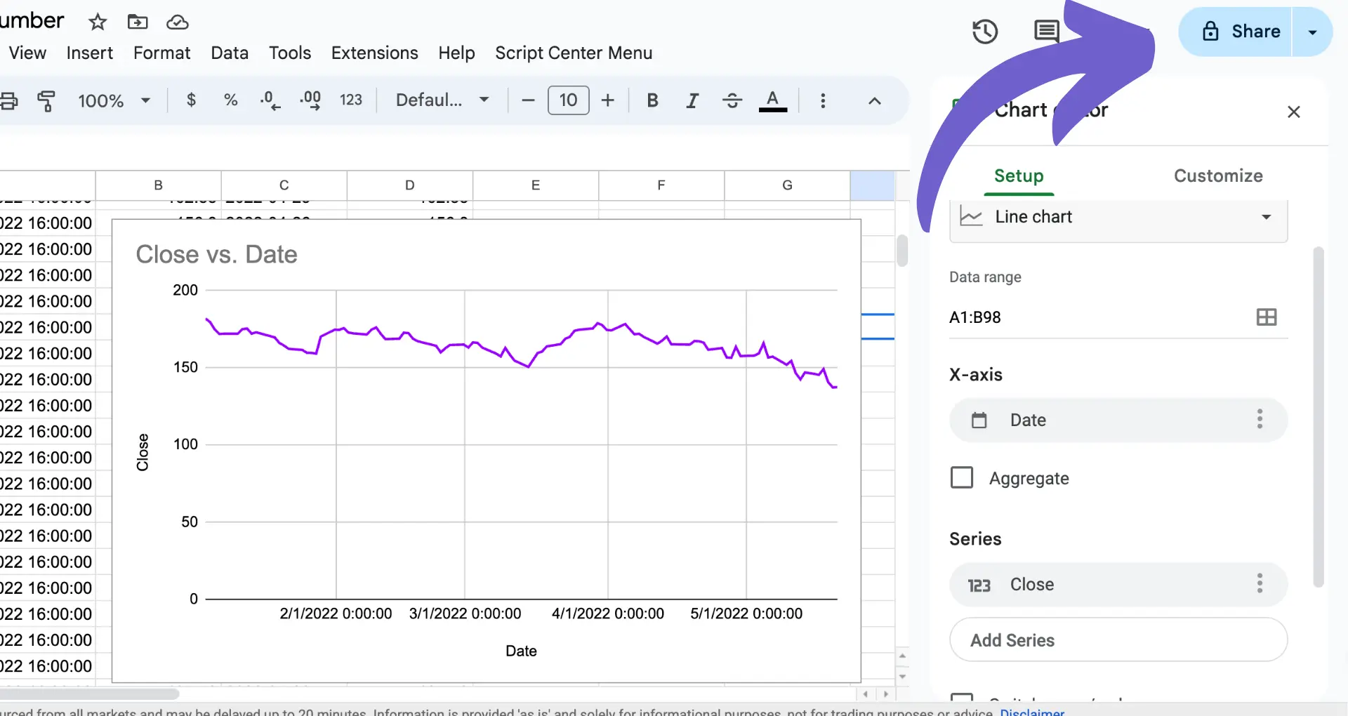
Once your data is prepared, you can easily create a graph in Google Sheets. Follow these step-by-step instructions:

  1. Select the data range you want to include in your graph, including the labels in the first row.
  2. Click on the "Insert" menu and choose "Chart" from the dropdown list.
  3. Google Sheets will automatically suggest a chart type based on your data. You can change the chart type by clicking on the "Chart type" dropdown in the Chart editor sidebar.
  4. Customize your chart using the options available in the Chart editor:
__wf_reserved_inherit
  • Change the chart title and axis labels
  • Adjust the font size and color of the title and labels
  • Modify the chart colors to match your preferences or branding
  • Add or remove gridlines, legends, and data labels

As you make changes in the Chart editor, your graph will update in real-time, allowing you to see how your customizations affect the final result. Once you're satisfied with your graph, click "Insert" to add it to your spreadsheet. For more advanced automation, try using a free AI web scraper to gather data.

Make your Google Sheets even more powerful by integrating Google Drive with other apps. Automatically organize and update your files without ever leaving your sheet.
__wf_reserved_inherit

Advanced Graph Customizations

Google Sheets offers several advanced features to enhance your graphs and make data interpretation more effective. Here are some of the key customizations you can explore:

  1. Trendlines: Add trendlines to your graph to visualize patterns and trends in your data over time. To do this, double-click your chart, go to the "Customize" tab in the Chart editor, and select "Trendline." Choose the type of trendline (linear, exponential, or polynomial) and customize its appearance.
  2. Error Bars: Represent the variability or uncertainty in your data by adding error bars to your graph. This is particularly useful for scientific or statistical data. To add error bars, double-click your chart, go to the "Customize" tab, and select "Series." Under "Error Bars," choose the type and style of error bars you want to display.
  3. Combo Charts: Combine different chart types (like a line and a bar chart) in a single graph to compare multiple data series effectively. To create a combo chart, select the data for your first chart type and insert it. Then, select the data for your second chart type, click "Insert," and choose "Chart." In the Chart editor, click the "Setup" tab and select "Combo chart."

By utilizing these advanced features, you can create more informative and visually appealing graphs that help your audience better understand the insights from your data. For more advanced tools, see how to scrape data from websites directly into Google Sheets.

Sharing and Collaborating on Graphs

Google Sheets makes it easy to share your graphs and collaborate with others in real-time. Here's how you can share your graphs and work together with your team:

  1. Click the "Share" button in the top right corner of your Google Sheets window.
  2. Enter the email addresses of the people you want to share your graph with, or click "Get shareable link" to create a link that anyone can use to access your graph.
  3. Choose the level of access you want to grant: "View," "Comment," or "Edit."
  4. Click "Send" or "Copy link" to share your graph.
__wf_reserved_inherit

When collaborating on graphs, it's important to set the right permissions to ensure data integrity. Here are some tips:

  • Give "Edit" access only to trusted collaborators who need to make changes to the graph.
  • Use "Comment" access for people who need to provide feedback or suggestions without making direct changes.
  • Set "View" access for stakeholders who only need to see the final graph without making any modifications.

Google Sheets also offers advanced sharing options, such as setting an expiration date for access or preventing viewers from downloading, printing, or copying the graph. To access these options, click "Share," then "Advanced" at the bottom of the sharing dialog box.

By leveraging Google Sheets' sharing and collaboration features, you can work together with your team to create informative, visually appealing graphs that drive data-driven decision-making. For more tips on boosting your productivity, see how to connect Excel with other apps.

Want to save even more time? Use Bardeen to integrate Excel with your favorite apps and automate tasks effortlessly. Try it now!

Automate Google Sheets Graphs with Bardeen

Converting data into a graph in Google Sheets can be done manually following the steps provided, or it can be fully automated to enhance efficiency and accuracy. Automating this process with Bardeen not only saves time but also allows for real-time data visualization, which is crucial for timely decision-making and data analysis. Embrace automation to streamline your workflows and make data-driven decisions faster.

Here are some examples of automations that can be built with Bardeen's playbooks:

  1. Export Google Trends Data and Save to Google Sheets: Perfect for marketing professionals and SEO specialists. This playbook automates the extraction of Google Trends data, ensuring your Google Sheets are always updated with the latest search trends.
  2. Save data from the Google News page to Google Sheets: Ideal for keeping up with current events or industry trends relevant to your business or research field. Automate gathering and organizing news information directly into your Google Sheets.
  3. Save information from Google Maps search results to Google Sheets: Streamline your market research or sales prospecting tasks by automating the extraction of Google Maps search results into a well-organized Google Sheets spreadsheet.

Discover how Bardeen can transform your data management and visualization processes. Start by downloading the app at Bardeen.ai/download.

Contents
No more copy-pasting from ChatGPT to Google Sheets

With Bardeen's GPT in Spreadsheets, you can easily use AI in Google Sheets or Excel in a few clicks.

Get Bardeen free
Schedule a demo

Related frequently asked questions

Quick Guide to Archiving Emails in Gmail (3 Steps)

Learn how to archive emails in Gmail to remove the Inbox label, organizing your inbox efficiently. Quick 3-step guide included.

Read more
Scrape Dynamic Web Pages with Python & Selenium: A Guide

Learn how to scrape dynamic web pages using Python and Selenium, including tips on handling JavaScript and avoiding CAPTCHAs.

Read more
How to Set Up Lead Routing in Salesforce: A Step-by-Step Guide

Learn how to set up lead routing in Salesforce. Follow our step-by-step guide to automate lead distribution, improve response times, and boost sales efficiency.

Read more
Export Salesforce Account List to Excel: A Guide (4 Steps)

Learn how to export Salesforce account lists to Excel, including handling account hierarchies and using Chrome extensions for streamlined data extraction.

Read more
Easy Steps to Delete Rows in Google Docs (2024)

Learn how to easily delete rows in Google Docs, including table rows and extra spaces, applicable on Mac, Windows, and Chromebook.

Read more
Download HubSpot Contacts Easily in 5 Steps

Learn how to download contacts from HubSpot in 5 easy steps, including exporting to Excel or MailChimp for efficient customer data management.

Read more
how does bardeen work?

Your proactive teammate — doing the busywork to save you time

Integrate your apps and websites

Use data and events in one app to automate another. Bardeen supports an increasing library of powerful integrations.

Perform tasks & actions

Bardeen completes tasks in apps and websites you use for work, so you don't have to - filling forms, sending messages, or even crafting detailed reports.

Combine it all to create workflows

Workflows are a series of actions triggered by you or a change in a connected app. They automate repetitive tasks you normally perform manually - saving you time.

get bardeen

Don't just connect your apps, automate them.

200,000+ users and counting use Bardeen to eliminate repetitive tasks

Effortless setup
AI powered workflows
Free to use
Reading time
Thank you! Your submission has been received!
Oops! Something went wrong while submitting the form.
By clicking “Accept”, you agree to the storing of cookies. View our Privacy Policy for more information.